When it comes to decorating home interiors, color is an essential factor that plays a significant role in setting the mood and creating an overall ambiance. While classic color combinations like black and white, blue and white, or neutrals are always safe options, it’s worth considering more unexpected color combinations to add flair to your home.
In this article, we will explore some unconventional color combinations that can add a touch of creativity and sophistication to your home.
MY (WORK) RELATIONSHIP WITH COLORS
I am fortunate to be constantly exposed to colors at work and get to experiment with different combos. My favorite color combination is green and pink. It has a vintage vibe yet it feels current. It can be dynamic and calm depending on the tint or shade used. Another is a medium shade of gray with a burst of yellow. The combination feels fresh and contemporary.

TECHNICAL TERMS
Before we proceed with the unexpected color combinations, I would like to discuss some technical terms. There are many terms to describe different aspects of color. Here are three important ones to know:
1. HUE. This is the purest form of a color, like red, blue, or yellow. When you think of a color, you’re thinking of its hue.
2. SHADE. A shade is a color that has been darkened by adding black. Shades of color are usually used to create depth and contrast in a space.
3. TINT. A tint is a color that has been lightened by adding white. Tints of color are usually used to create a softer and more airy feel in a space.
Understanding these terms can help you make more informed decisions when it comes to choosing colors for your home. For example, if you want to create a cozy and moody feel, you might opt for shades of blue. If you want to create a bright and cheerful space, you might opt for tints of yellow.
COLORS IN DIFFERENT SPACES
Colors can stir emotions and can potentially affect people’s behaviors. Quick-service restaurants (read: fast food) utilize warm colors like red and yellow to stimulate appetite but use uncomfortable furniture for faster table turnover. Hospitals use white, green, and blue to establish a clean, hygienic, and healing vibe.
UNEXPECTED COLOR COMBINATIONS IN HOMES
You’re probably tired of the usual color combinations and looking for something different, or the people you are living with have different preferences and have their favorite colors and don’t want to compromise. Using unexpected color combinations is a great way to make your space stand out and create a unique look that reflects your personality (and the people living with you) and design identity.
These are unexpected in the sense that these do not first come into my mind when selecting colors and may sound weird when heard the first time. Here are some unexpected color combinations to try:
BLACK AND BLUE


Pairing blue with white is classic, but pairing it with black can overwhelm it. You could use a dark shade of blue as the dominant color and black as an accent. If your room has access to a lot of natural light or want to make it dramatic, use a lighter tint of blue as the accent in a room full of black finishes.
BROWN AND ORANGE


Though the colors are both warm tones, these two might blend and look bland. This combination is best achieved through the use of wood finishes for the brown, and upholstery for the orange. The brown will have depth since there will be wood grains while the orange will pop.
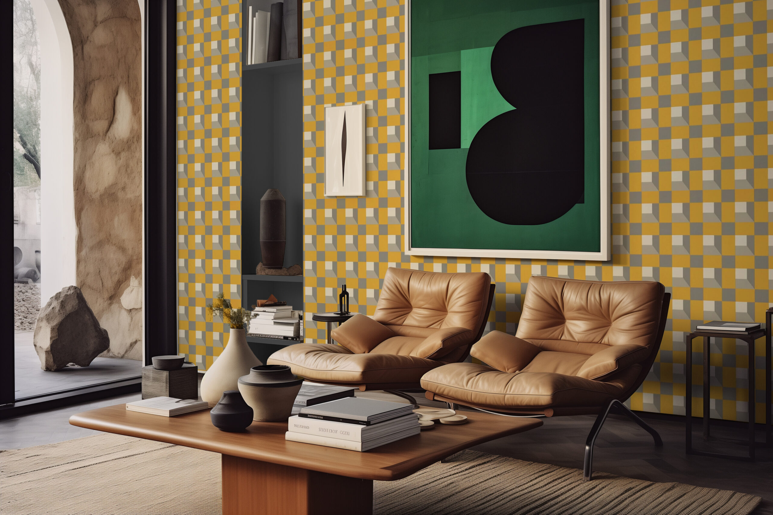
BLUE AND YELLOW


Combining these two primary colors can feel like preschool. It is crucial to select the best shade and tint to make this work. If you are bold enough, use a deep shade of both colors and commit to it. Use it in the furniture and the area rug. Another route is to use a pale version to create a bright and refreshing space.
GREEN AND RED


These colors scream Christmas but can achieve a dramatic interior by selecting materials properly. Use deeper shades to create a modern classic vibe. Mixing and matching patterns can be a great way to add depth and texture to your space. Consider using a patterned red and green area rug or wallpaper to add visual interest to your home.
BROWN AND PEACH


These colors have opposite effects even though they have the same warm vibe. Peach is cheerful and bright, while brown can be serious and earthy. Darker shades of brown work well with lighter tints of peach. Brown is a natural color, so using natural materials like wood, leather, and rattan can help create a cohesive and harmonious look.
Here are general tips for applying multiple color combinations in your home:
1. Once you’ve chosen your color scheme, choose one color to be the dominant color. This color should be used in the largest areas of the room, like the walls or the furniture.
2. Use the other colors as accents. The other colors in your color scheme should be used as accents in the room. This could be through accessories like throw pillows, artwork, or rugs similar to how we applied Peach Fuzz.
3. Use neutrals. To balance the colors, use neutral colors like white, gray, or beige. This will prevent the space from feeling too overwhelming or chaotic.
4. Use color samples. Before committing to a color, it’s important to test it out in your home. Get some color samples and try them on your walls to see how they look in different lighting conditions. It is better to have an actual paint swatch than to use your phone. Once you have selected your colors, you can have your paint mixed by the store.
As much as these guidelines are important, choosing colors for your home is a personal decision. Choose colors that make you feel happy and comfortable, and match your personality and lifestyle. Don’t be afraid to experiment and have fun with color in your home!
What other unexpected color combinations do you want to see, and where do you want it applied?