As mentioned in my previous post, I was fortunate to be constantly exposed to colors at work. Decorating with pastel colors is what I first ever did with the account I have been managing for the longest time. It is for a brand with a market for teens and young adults. Its design identity is inspired by desserts, florals, kitsch, and anything conventionally girly.
Each store uses at least four pastel colors in paint, wallpaper, or tile on the walls. The only non-pastel surfaces will be the floor, ceiling, and trims. Using pastels in this instance is relatively easy as it fits the branding. It is also a commercial space that needs to attract people.

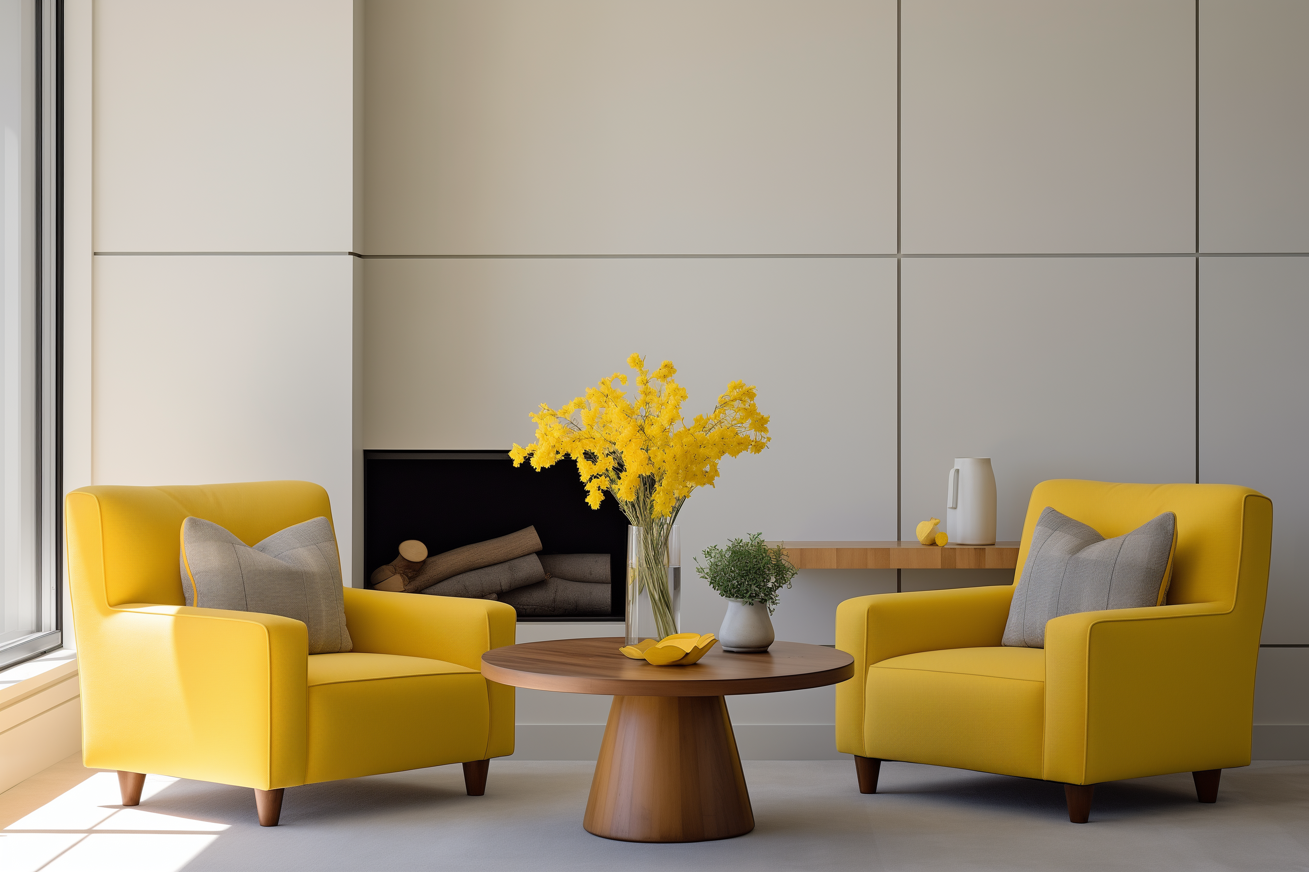
Wallpaper from Farrow & Ball (not to scale)
Pastels can also work on homes in multiple colors and applications in one room because of their light and airy look.
WHAT ARE PASTEL COLORS?
Pastels are pale tones of colors made by combining a significant amount of white into the original color. Pale, muted, and light are words usually associated with this color. It has a calm, whimsical, and youthful vibe.

PASTEL COLOR APPLICATIONS
1. It can be used in rooms with ease because of its light tones.
2. Stack multiple colors in one room and still achieve an airy ambiance.
3. Create a monochromatic look with one color. Mix it with its richer counterpart to achieve a look that has more depth.
4. Even though it is easy to use pastels, it is important to balance them with other colors or finishes. Use wood finishes and neutrals like gray or black to balance its sweet tones.
INTERIOR DESIGN STYLES
Pastel colors can be applied to any style, and these work great on the following because of their white undertones:

SHABBY CHIC
According to Apartment Therapy, it is an interior decorating style characterized by predominantly white spaces, floral prints, ruffles, and soft, pastel colors. It’s full of vintage charm with a time-worn look… Pastel pink, green, and yellow colors in upholstery, wallpaper, and drapes will shine here as this style tends to utilize a lot of florals.
MODERN FARMHOUSE
Think neutral color scheme, antique accent pieces, barn doors, reclaimed wood, and plants. I was exposed to this style early from the show Fixer Upper where Joanna Gaines renovates old houses into farmhouse-style homes. She utilizes the existing architecture and adds highlights such as exposed wood beams and handmade furniture. Since this style is predominantly neutral, use pastel colors through furniture accents and accessories.
COASTAL
This style has an airy atmosphere that uses light finishes punctuated by blues. All-white interiors are combined with shiplap walls, oak wood floors, fabric furniture, woven accents, and wood beams. Use powder blue and other tones of blue in furniture, patterned pillows, and window treatment accents to achieve a layered yet breezy look.


ECLECTIC
Since this is a culmination of different design styles into one look, decorating with pastel colors here could be easy. You can apply pastel practically anywhere – wallcovering, patchwork furniture upholstery, statement objects, drapes, artwork. Eclectic is all about having fun but making sure that it doesn’t get messy and that every piece has a point.
TRADITIONAL
If you want to keep the traditional features of your home but want to make it fresh, paint over the ornate trims and moldings. It will soften its intricacies and be highlighted in the room. Pastels will create an interesting contrast against wood furniture and traditional patterns.
DIFFERENT WAYS IN DECORATING WITH PASTEL COLORS
These saccharine colors can be applied in rooms in a lot of ways but notably the following:
PAINT
Paint a room in one shade for a sophisticated look or combine multiple colors for a playful vibe. Do not limit yourself to walls and consider painting the ceiling as well. Painting the ceiling in a pale color like yellow with give the illusion of light and height. If you want something subtle, paint the wall trims and door moldings instead. This can create a modern classic vibe as the traditional features will create interesting graphic lines that will frame the room.


Bored of one color but do not want to use multiple colors? Use different tones of one color. Make sure to use a paint finish that is easy to maintain as stains can be easily seen in these colors. Semi-gloss paint is usually the way to go.
WALLPAPER

If you cannot commit to whole walls painted in pastel, consider wallpaper or mural. This way, hints and accents of pastel colors are combined with other colors and patterns. If you can’t find a wallpaper that matches your design identity, a hand-painted mural or stenciled pattern can be another option. This way, you can design your patterns and combine the colors you like. Just be sure to observe proper scale when doing your designs!
DECORATING WITH PASTEL COLORS THROUGH ART AND DECOR
A statement artwork or sculpture in a pastel color scheme can bring dynamic and playful energy to a space. Create a gallery wall of pastel prints and sculptures to liven up an empty wall. One of the gallery exhibitions I attended has these stylized female figures as subjects with a backdrop of pastel pink clouds, powder blue skies, and yellow stars, adorned with iridescent confetti. An artwork like this can easily transform a blank space into something joyful.


Another way to bring in pastels is to cover books in specialty papers to create a uniform look that can match the vases and fresh flowers.
FURNITURE


Paint over your existing furniture to give it a simple refresh. I know I mentioned that I dislike painting over solid wood pieces but painting over old furniture will breathe in a new life. You can easily sand the finish off if you no longer feel the pastel tones. Select paint finishes that match the furniture material so the color will adhere. This works particularly well with traditional pieces as it creates a contrast between intricate woodwork and contemporary pastels.

Another way is to incorporate the colors through upholstery. There are a multitude of plain and patterned fabrics in the market that can match the look you want. In our office, we love using synthetic leatherette in pastel colors as it looks soft and pretty yet very durable, especially in restaurants. We also love using toile de jouy in pastel colors to add intricate patterns in a space without feeling overbearing.
WINDOW TREATMENTS
Drapes in pastels can add depth and drama to any space without looking heavy. Having yards of fabrics in light colors covering windows and walls adds depth and softness. Think of materials like velvet, linen, and jacquard. Patterned curtains can also be an option but they tend to have a theme that might be difficult to fit your style.

DECORATING WITH PASTEL COLORS THROUGH WALL TILES
If you have the opportunity to renovate your kitchen or bathroom, consider using pastel-colored tiles. There is now a plethora of designs, finishes, and shapes available in the market. Use a white grout to emphasize the individual tiles. This will bring a sense of softness to a space that is usually associated with hard surfaces.


What’s great about decorating with pastel colors is its light tone. It goes well with light-colored and natural wood finishes and can fit a lot of interior design styles with ease.